3 COMMON PHARMACY LAYOUT MISTAKES – AND HOW TO FIX THEM
Even the best-looking spaces can create daily headaches if they aren’t designed with function in mind. A well planned layout isn’t just about aesthetics – it’s about creating a space that allows your staff to work efficiently, your patients to move comfortably and your business to thrive.
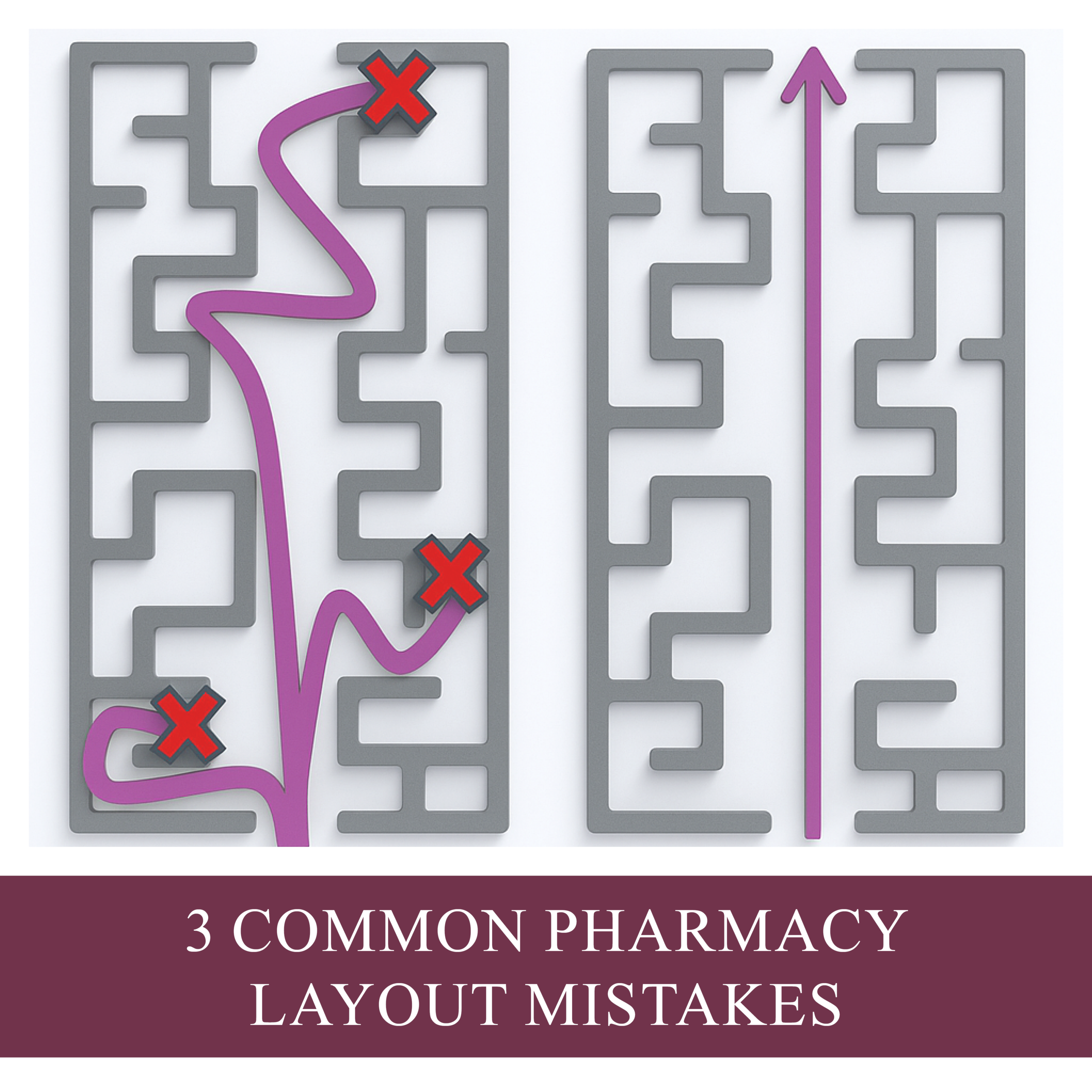
Here are 3 common layout mistakes we see:
MISTAKE 1: Unclear Workflow Paths
When essential areas of your pharmacy – like script in/out points or dispensary stations – are poorly positioned, staff end up crossing paths constantly. This can make the day feel chaotic and the space feel more confined. This doesn’t just create frustration, it slows down your workflow and increases the risk of errors.
Think about your workflow like a relay race. Each step should flow logically into the next, with minimal backtracking or crossover. A well-planned layout maps out staff movement and reduces unnecessary steps. This frees up pharmacists to spend more time where they’re most valuable – with patients.
Imagine a pharmacy where a busy day feels easy and manageable, where staff can maintain efficiency without the constant stress of congestion. A thoughtful layout can help:
- Improve staff satisfaction and retention
- Reduce errors
- Allow your team to be both efficient and effective
A thoughtful refit can transform how your staff experience a busy day – shifting from chaotic and cramped to smooth, productive and achievable.
MISTAKE 2: Poor Patient Flow
Patient congestion is one of the fastest ways to create a negative experience in your pharmacy. Even if your business is thriving, patients don’t want to feel like they’re in the middle of a bottleneck.
I once worked in a busy retail pharmacy where patients would often say, “This must be the busiest shop in town!” While flattering, it sometimes gave our patients the impression that staff were too rushed to help. What happens if patients feel we’re too busy for them? They may choose not to ask questions or seek advice about their health.
Smart pharmacy design helps patients move naturally and comfortably throughout the space, without hitting congestion points. It ensures your pharmacy feels welcoming, professional and always ready to help.
Good design can:
- Minimise congestion and waiting frustrations
- Maintain a professional, approachable image
- Encourage patients to engage more with pharmacists
When patients feel there’s space and time for them, they’re far more likely to see your pharmacy as their go-to healthcare destination
MISTAKE 3: Resistance to Change
The pharmacy landscape is evolving. Many owners are keen to add clinic rooms or consultation areas but hesitate to update dispensary layouts. This resistance can limit the benefits of these new spaces.
We’re all creatures of habit. It’s easy to stick with what’s familiar – but what got you here won’t necessarily get you to where you want to be. Designing for the future means more than updating finishes or adding the clinic room – it requires aligning your space with your business strategy. Ask yourself: What services do we want to deliver in five years and does our layout support that?
Updating outdated dispensary layouts improves workflow efficiency, which frees up the pharmacists’ time for these all-important consultations.
Ask yourself:
- Do you want to increase patient–pharmacist interactions?
- Do your pharmacists have enough time for consultations?
Embracing new layouts and workflows helps your team work smarter, not harder, while maximising the value of your space and your services both now and into the future.
Conclusion
With thoughtful adjustments, you can save time, improve safety and enhance the experience for both your staff and patients. Functional design doesn’t just look good – it transforms the way your pharmacy operates, feels and is perceived.
Ready to optimise your pharmacy layout?
Contact us today to discuss how a smart design can improve workflow, patient experience and staff satisfaction.